Explore the transformation of user experience through redesign in this insightful case study of Lance Buyer’s Guide.
Addressing App Challenges: Project Overview
In this project, we tackled usability issues and improved the overall user experience of the Lance Buyer’s Guide app. The key challenges were its difficulty to navigate, discouraging user interactions, and an inconvenient landscape view on mobile devices. Our mission was to execute a complete redesign to enhance usability, boost user engagement, and transition from landscape to portrait orientation for improved mobile accessibility.
Lance Buyer’s Guide: Our Valued Client
Our client, Lance Buyer’s Guide, a trusted name in camper purchasing assistance, approached us with a clear objective: to improve their app’s usability and enhance the experience for their users. They were concerned about the app’s navigation challenges and its impact on user engagement. Furthermore, with a commitment to serving retired veterans, the client sought a solution that would make the app more accessible and user-friendly for their target audience.
Initial App Challenges: Setting the Stage for Transformation
Difficult Navigation in Lance Buyer’s Guide App
Users found the app hard to navigate, which led to frustration and confusion, discouraging meaningful interactions.
Low User Engagement in the App
The app’s challenging navigation discouraged users from actively using it, resulting in reduced user
Inconvenient Landscape View in the App
The app’s landscape orientation on mobile devices, while unconventional, posed a significant inconvenience, especially for retired veterans.
Additionally, addressing these problems formed the core focus of the redesign project, as outlined in the case study.
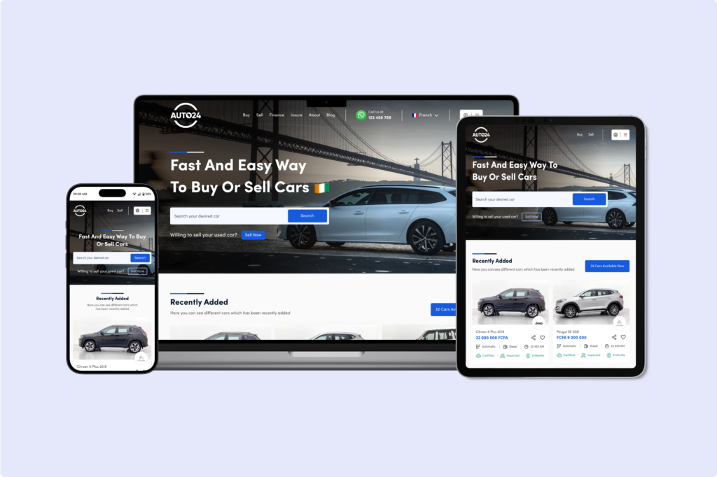
Check out our case study on Auto24 where we talk about creating a modern, user-friendly interface of a marketplace that would streamline the vehicle buying and selling process, increasing user engagement, and ultimately driving business growth.
Addressing Key Challenges: Implemented Solutions
Improved Navigation in Lance Buyer’s Guide App
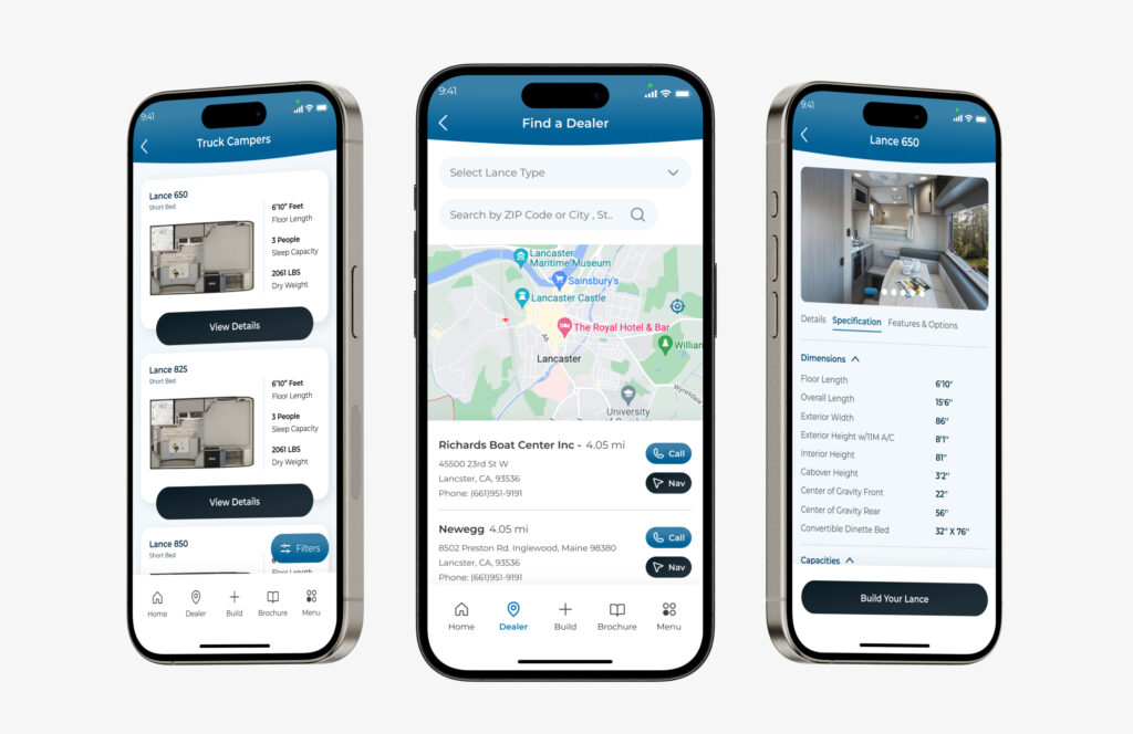
We redesigned the app’s navigation, simplifying menu structures and introducing an intuitive user flow. Further, this made it easier for users to find information and features, enhancing overall usability.
Enhanced User Engagement
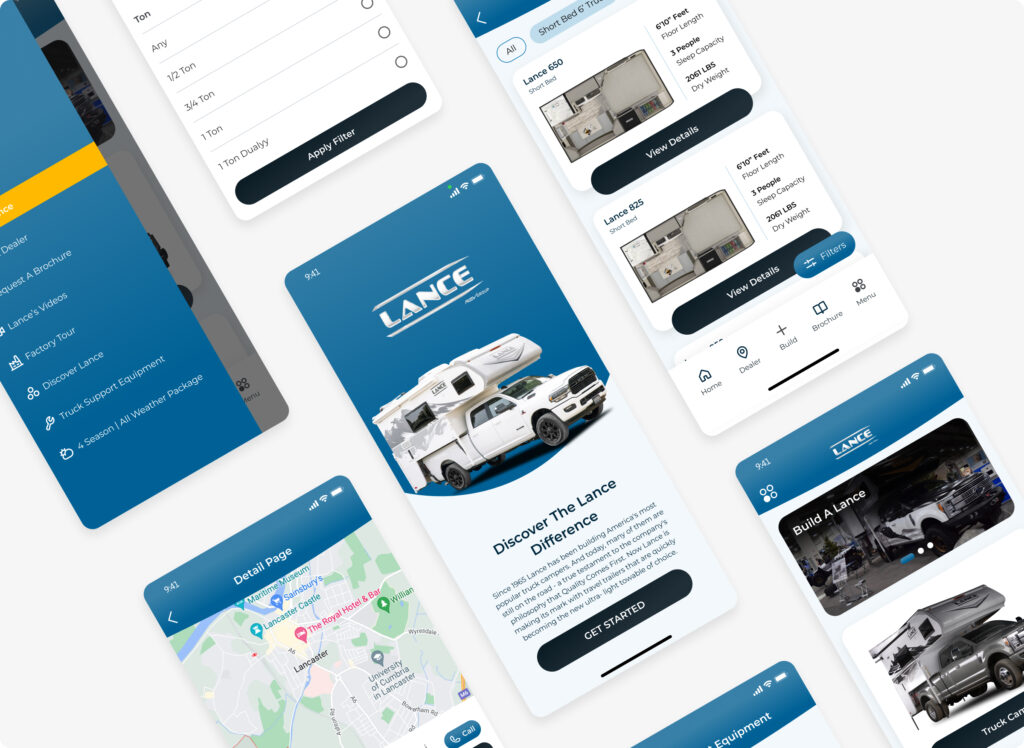
Our redesign focused on user-centric design principles, simplifying navigation and enhancing the overall user experience. Moreover, this approach encouraged users to explore and interact more actively.
Mobile Accessibility Enhancement
We transitioned from landscape to portrait orientation for mobile devices, ensuring a more user-friendly experience. This change significantly improved mobile accessibility, particularly for retired veterans.
These solutions collectively addressed the initial problems and transformed the Lance Buyer’s Guide app into a user-friendly platform, resulting in increased user engagement, satisfaction, and a sense of community among app users.
You can also check a web design case study on Anot, all about revamping Anot Architecture N Architect’s Online Image.
Measurable Impact: Results of Implemented Solutions
After implementing our comprehensive solution, we observed significant positive impacts on the Lance Buyer’s Guide app:
Improved User Engagement in Lance Buyer’s Guide App
User engagement saw a substantial increase, with users spending more time exploring the app and customizing campers. This was a direct result of the simplified navigation and enhanced user experience.
Enhanced Mobile Accessibility
The transition to portrait view on mobile devices resulted in a mobile experience that was more user-friendly and aligned with user expectations. This change led to greater user satisfaction among both retired veterans and other users.
User Satisfaction
User feedback became overwhelmingly positive, with users expressing their appreciation for the more intuitive design, enhanced customization options, and the sense of community fostered by the Lance Buyer’s Guide app.
Increased User Confidence
The interactive customization tools empowered users to make informed decisions about their camper purchases. This boost in user confidence translated into a higher conversion rate for camper orders.
Overall, our solution successfully addressed the initial usability challenges, creating an app that not only met the functional needs of its users but also provided an enjoyable and empowering experience. The positive impact was reflected in increased user engagement, satisfaction, and a sense of community among app users.
