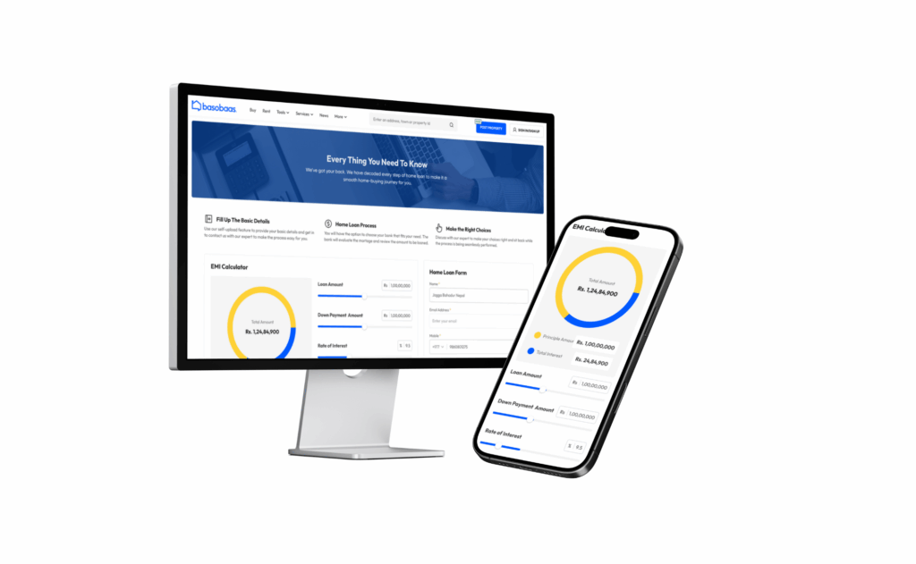
The focus is on transforming the Basobaas platform, emphasizing both the scope (real estate) and the process (redesign journey).
Company Overview of Basobaas
Basobaas is a leading real estate marketplace in Nepal, providing a platform for buying, selling, and renting properties.
Project Goal
The redesign aimed to enhance user experience, streamline navigation, and improve property search functionality.
Problems
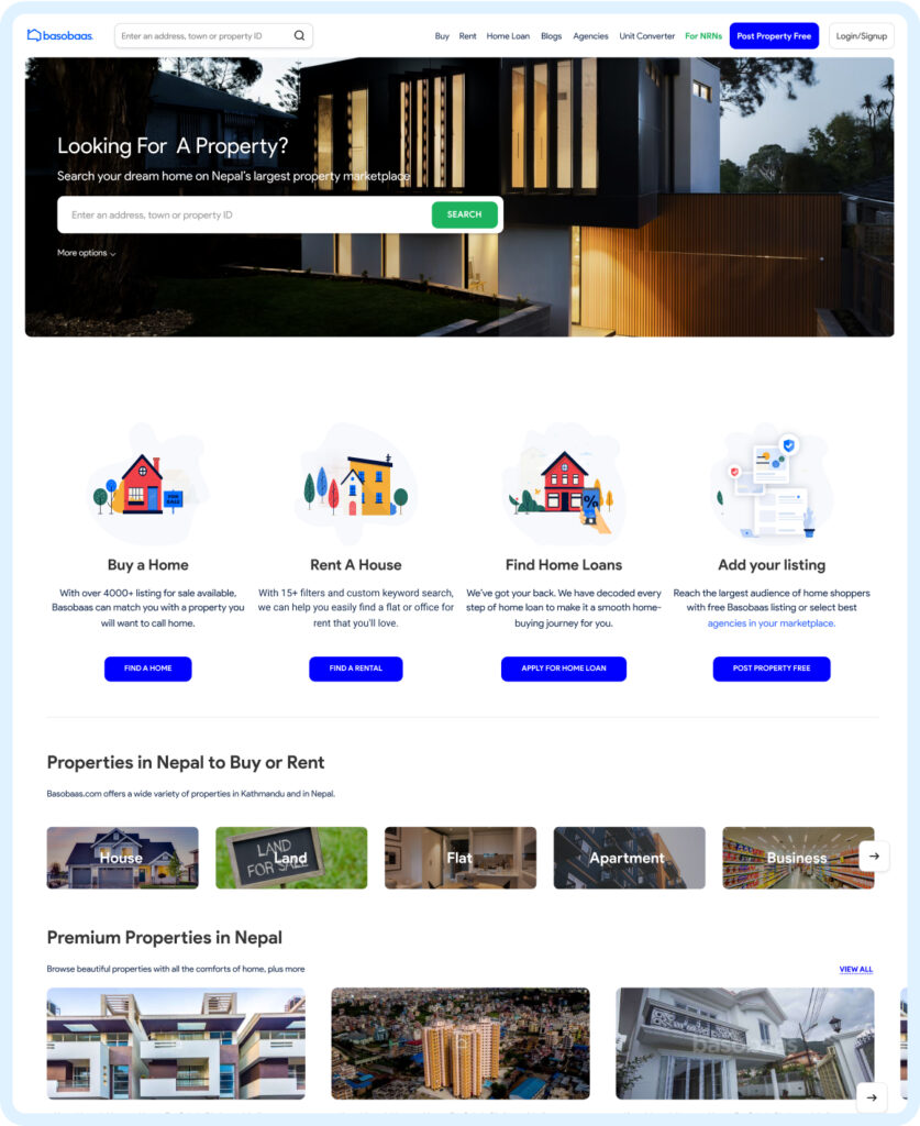
Outdated Design of Basobaas
-
- The previous design of Basobaas was not visually appealing.
-
- It featured outdated graphics, a lack of modern UI elements, and an overall aesthetic that did not inspire confidence or engagement among users.
-
- This led to a poor first impression and lower user retention.
Navigation Issues in Basobaas
-
- Users found it difficult to navigate the site of Basobaas due to a cluttered and confusing menu structure.
-
- Important information and features were buried under multiple layers of menus, making it hard for users to find what they were looking for quickly.
-
- This resulted in frustration and increased bounce rates.
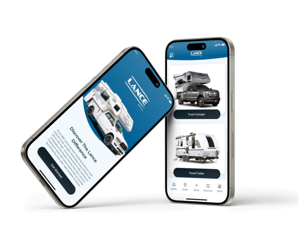
Here’s a case study on Lance Buyer’s Guide Redesign: A Seamless User Journey, check it out!
Search Difficulties
-
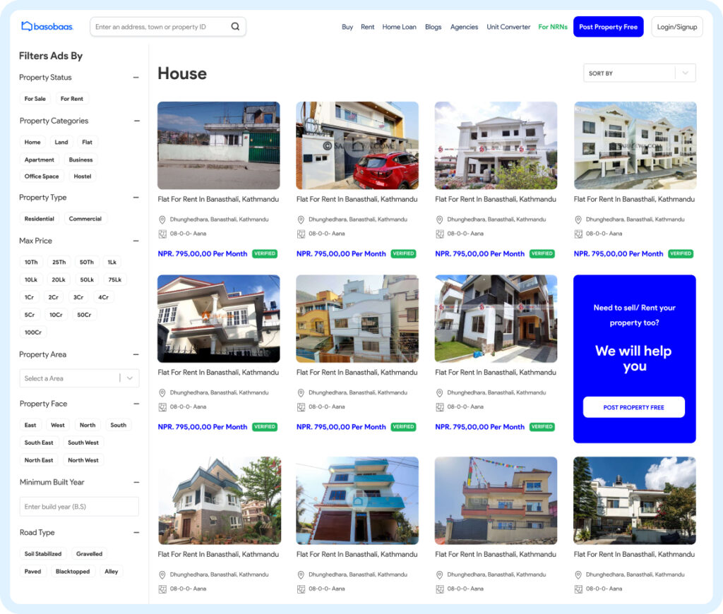
- Searching for properties was particularly challenging in Basobaas.
-
- The search functionality was limited and not user-friendly, especially when trying to filter properties by category.
-
- Users often struggled to refine their search results, leading to an inefficient and frustrating experience.
-
- The lack of effective filters meant users had to sift through irrelevant listings, which was time-consuming.
Cluttered Detail Pages
-
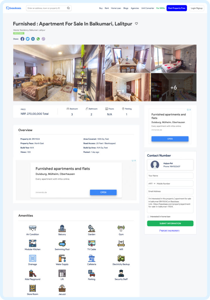
- Property detail pages were cluttered with too much information presented in a disorganized manner.
-
- Key details about properties were not easily accessible in Basobaas, and the overall layout was overwhelming. Users had to spend considerable time navigating through dense text and images to find essential information, which detracted from the user experience.
Responsive Design Limitations
-
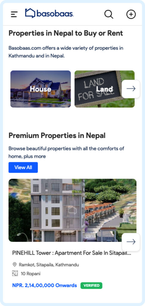
- Although the site of Basobaas was responsive, the implementation was inadequate.
-
- The design did not adapt well to different screen sizes, particularly mobile and tablet devices.
-
- This resulted in a suboptimal user experience, with elements not properly scaling or reflowing, making the site difficult to use on smaller screens. Hence, this was a significant drawback in a market where mobile usage is prevalent.
Check out our other case study on Agrobase: Exploring The Digital Transformation Of Agriculture.
Solutions
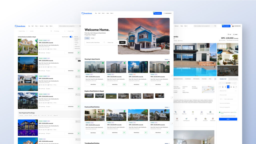
Simplified Design
-
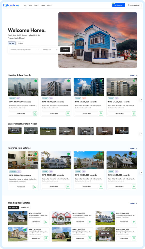
- The redesign of Basobaas focused on simplifying the overall design with clean card interfaces.
-
- This approach involves using card-based layouts that are visually appealing and easy to navigate.
-
- Each property listing is presented in a well-defined card, making it easier for users to scan through listings quickly.
-
- The clean interfaces reduce visual clutter, providing a more organized and intuitive browsing experience.
-
- In addition, this not only improves the aesthetic appeal but also enhances usability, helping users find relevant information more efficiently.
Navigation in Basobaas
-
- The new design includes a streamlined navigation system where users can easily find what they need.
-
- A dedicated search functionality allows users to search properties by specific categories such as residential, commercial, or rental, making the process more efficient and user-friendly.
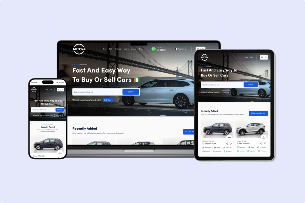
Check out Auto24: Building Africa’s Used Car Marketplace for Success, a case study about creating a modern, user-friendly interface of Auto24 that would streamline the vehicle buying and selling process. Additionally, increasing user engagement, and ultimately driving business growth
Search Filters
-
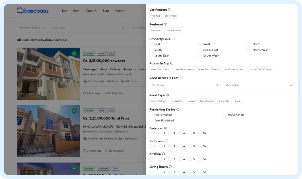
- The search filters have been revamped to be more intuitive and comprehensive.
-
- Users can now refine their searches based on various criteria like price range, location, property type, and amenities.
-
- This helps users find properties that match their specific requirements quickly and accurately.
Detail Pages in Basobaas
-
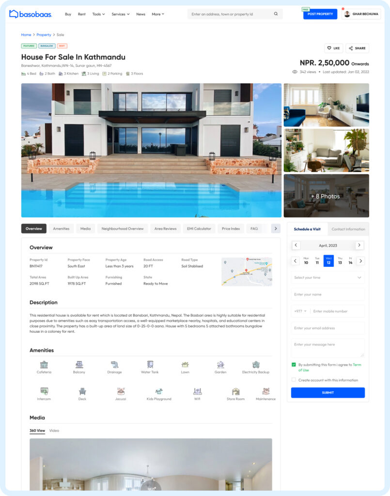
- The property detail pages have been reorganized to present information in a clear and structured manner in Basobaas.
-
- Depending on the property category, key details are highlighted and grouped logically, further, reducing clutter and making it easier for users to absorb important information at a glance.
Moreover, you can check out the site of Basobaas after the redesign here.
Responsive Design Limitations
-
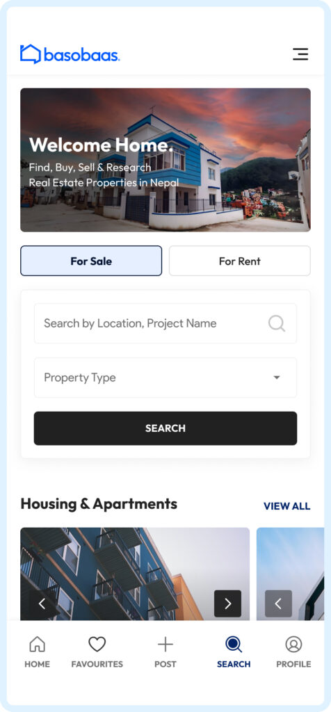
- The redesign includes an adaptive design approach, ensuring the website provides an optimal user experience across various devices and screen sizes.
-
- Unlike simple responsive design, adaptive design dynamically adjusts the layout and elements based on the specific device, further, offering a seamless experience whether users are on a desktop, tablet, or mobile phone.
Additionally, a case study on redesigning, Revamping Anot Architect’s Online Image: A Website Redesign Case Study might interest you.

